Homebrew labelling is more than just putting a name on your creation—it’s a chance to express your creativity and make your brew stand out. In this article, we’ll explore practical tips for designing captivating and unique labels that add an artistic touch to your home brew bottles.
Reflecting Your Brew’s Personality: A Visual Introduction
Your home brew label is the first impression, so let it reflect your brew’s personality. Whether it’s bold and hoppy or smooth and malty, convey the essence of your beer through colour choices, imagery, and font styles that align with its flavour profile.
Clear and Readable Text: Legibility is Key
While artistic flair is essential, ensure that your label’s text is clear and easy to read. Choose legible fonts, appropriate font sizes, and high-contrast colours to guarantee that anyone picking up your bottle can quickly grasp the beer’s name, style, and any other relevant information.
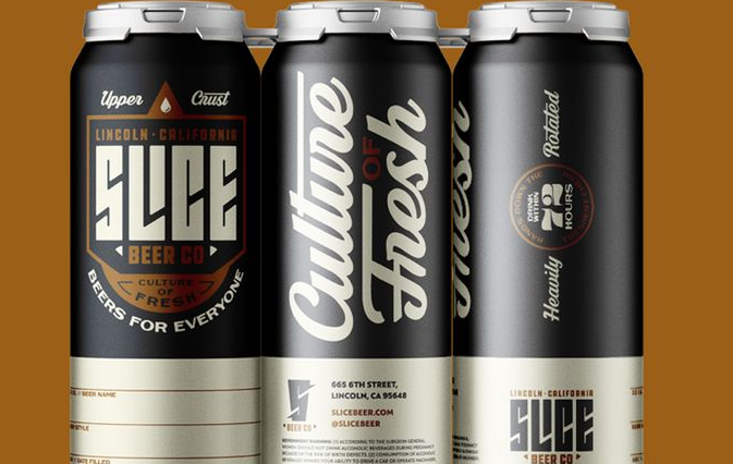
3Theme Consistency: A Cohesive Visual Story
Maintain a cohesive theme across your homebrew labels. Whether it’s a specific colour scheme, imagery, or design elements, consistency contributes to brand identity. This thematic approach helps your brews become recognizable and builds a visual connection with your audience.
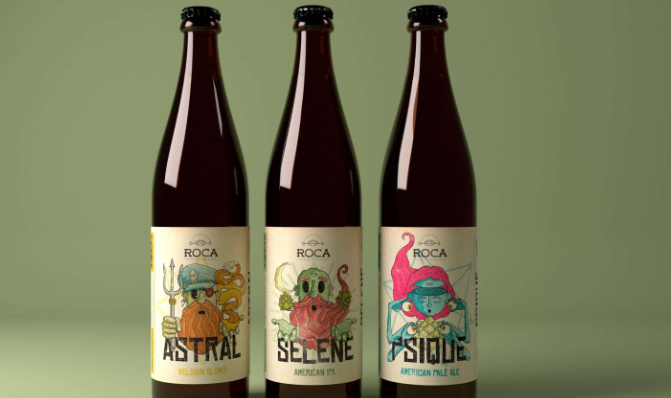
Imagery: From Brew Process to Final Pour
Incorporate images that tell the story of your brewing journey. From the raw ingredients and the brewing process to the final pour, use visuals that convey the craftsmanship behind your brew. These images add a personal touch and enhance the narrative of your home brew.
Utilize Negative Space: Simplicity Speaks Volumes
Embrace the power of negative space in your homebrew labelling design. A clutter-free layout with well-utilized negative space not only enhances readability but also creates an elegant and sophisticated look. Simplicity often speaks volumes in design, allowing your label to stand out effortlessly.
DIY Illustrations: Hand-Drawn Charm
Inject a personal touch by creating your own illustrations. Whether it’s sketches of ingredients, doodles representing the brewing process, or hand-drawn typography, DIY illustrations add a charming and unique element to your home brew labels.
Colour Psychology: Conveying Flavor Through Hues
Consider the psychological impact of colours when designing your homebrew labels. Reds and browns might evoke rich and robust flavours, while lighter hues can suggest a refreshing taste. Use colour psychology to your advantage, aligning the label with the sensory experience your brew offers.
Waterproof Materials: Protecting Your Artwork
Practicality matters when it comes to homebrew labels. Choose waterproof label materials to ensure that your carefully designed labels withstand the condensation and potential spills that come with storing and serving your brew.
Labeling Software: Streamlining the Design Process
Explore label design software to streamline the creative process. These tools often come with templates, fonts, and graphics tailored for label design. Utilizing such software can make designing labels more accessible, even if you’re not a professional graphic designer.
Collaboration with Artists: Outsourcing Creativity
If artistic design isn’t your forte, consider collaborating with a local artist or graphic designer. Their expertise can elevate your home brew labels to new heights, adding a professional touch while still infusing the unique essence of your brew.
Typography Variations: Mixing Fonts for Artistic Flair
Experiment with typography variations to add artistic flair to your labels. Combine different fonts for the beer name, style, and additional information. Play with font sizes and styles to create a visually interesting hierarchy that complements the overall design.
Texture and Finish: Elevating the Tactile Experience
Consider the tactile experience of your labels by incorporating textured materials or finishes. Opt for labels with a matte, glossy, or even textured surface. This not only adds a luxurious feel to your bottles but also enhances the overall sensory appeal of your homebrew.
Conclusion
In conclusion, homebrew labelling is an art form that allows you to showcase the individuality of your creations. From thematic consistency to DIY illustrations, these practical tips ensure that your labels are not just informative but also visually captivating. As you embark on this creative journey, remember: your labels are a canvas for expressing the passion and craft that go into each bottle of your homebrew. Cheers to crafting labels as unique as your brews!